problem
The gap between planning and doing
Existing productivity apps primarily emphasize task completion and organization rather than addressing the motivation and focus needed for users to initiate tasks. As a result, users frequently neglect productivity apps and lack the necessary motivation to start their tasks.
high level goals
- Track and manage users’ assignments and everyday tasks.
- Keep users accountable by completing
- Make productivity engaging and interactive.
my contribution
Content and Design
As the Content Lead, I focused on building our design library and crafted content for the high-fidelity prototype to ensure consistency across the product. I also prototyped interactions in Figma, designed the social feed, and participated in usability testing by interviewing users for feedback.
solution
Momentum: Social Productivity App
Momentum is a mobile app that utilizes the power of photo sharing and community engagement to motivate users in accomplishing tasks and achieving their goals.
Create and Track Tasks
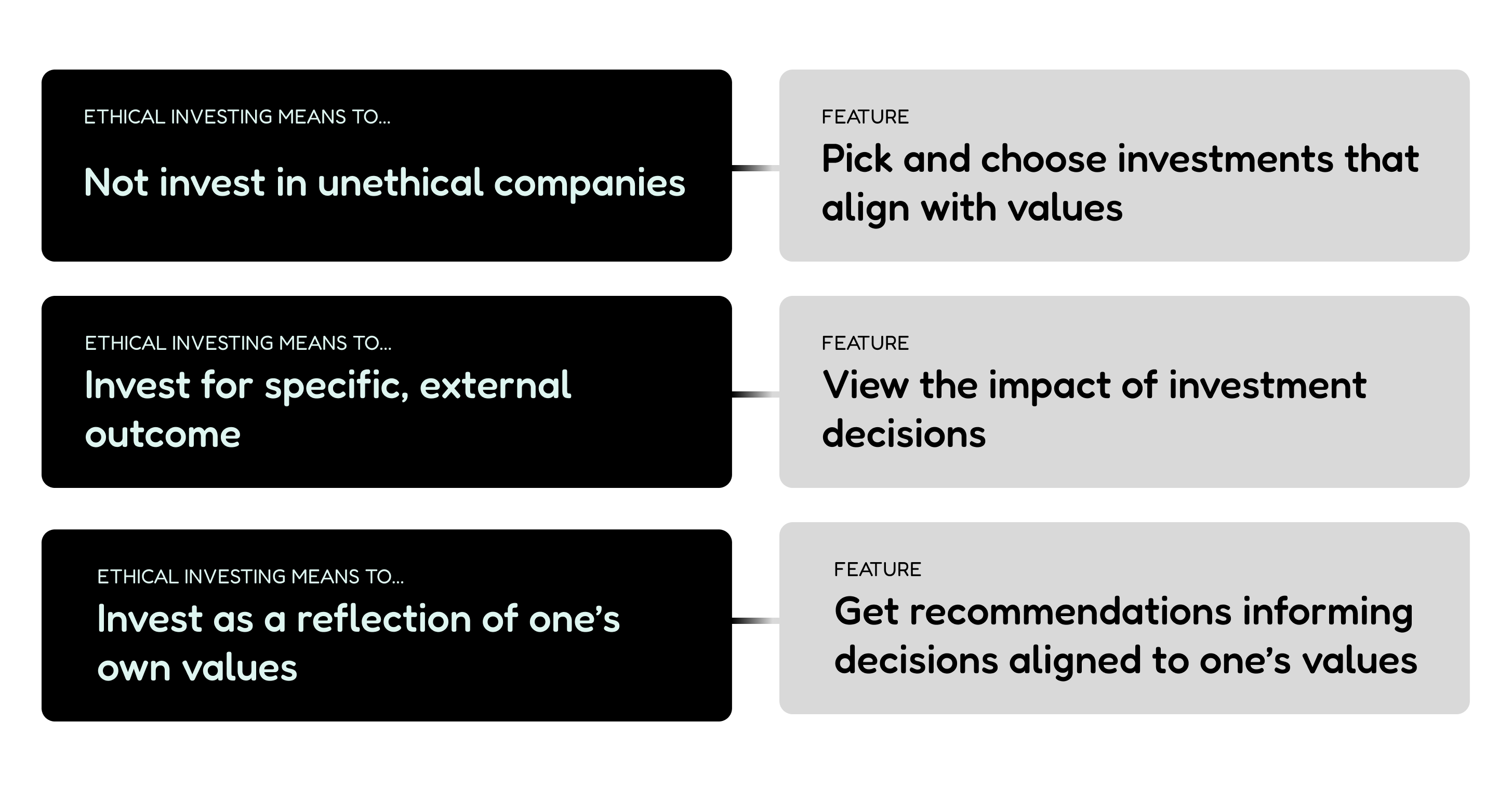
Investors can explore investment products through industries that users are passionate about.
Focus mode lock
Through metrics, investors can have tangible impacts made through their investments.
Task completion feed
Investors can explore investment products through industries that will interest the user.
jump to designuser research
Uncovering Productivity Challenges
A survey revealed 41 insights into productivity challenges, followed by eight interviews that surfaced common struggles with prioritization, time management, and the need for a sense of accomplishment.
Also, 34% of survey respondents emphasized the importance of accountability and body doubling in staying productive, indicating a gap in existing productivity tools' ability to effectively address these needs.
Also, 34% of survey respondents emphasized the importance of accountability and body doubling in staying productive, indicating a gap in existing productivity tools' ability to effectively address these needs.
pain points
Not being able complete tasks makes inadequate
Additionally, many users said that they had feelings of stress due to the inability to manage their tasks and commitments.

pain points
Exisiting tools don't work
a significant amount of respondents expressed frustration with existing productivity tools' inability to maintain their focus and motivation. , indicating a gap in existing productivity tools' ability to effectively address these needs.
So what works?
The importance of accountability and body doubling
lso, 34% of survey respondents emphasized the importance of accountability and body doubling in staying productive, indicating a gap in existing productivity tools' ability to effectively address these needs.
Empathy map
Our target audience
We focused our product towards students aged 18-25 who struggle with time management or have ADHD and would like to have a structured and supportive approach to boosting their productivity.


Competitive research
A niche market for social productivity
While looking into competitors we only found one that integrated photo sharing and social networking elements: Todewy. Seeing that it is a niche market we know that momentum will stand out
We looked at 3 other popular indirect competitors which goal is in managing and executing tasks. But there is caution into making things complicated like notion or have a pay block like forest.
We looked at 3 other popular indirect competitors which goal is in managing and executing tasks. But there is caution into making things complicated like notion or have a pay block like forest.
kano survey
Turning our insights into a flow
We completed a comprehensive task analysis of 4 competitors user flows to gain insight into existing app strategies, strengths, and weaknesses.
visual design
Design System
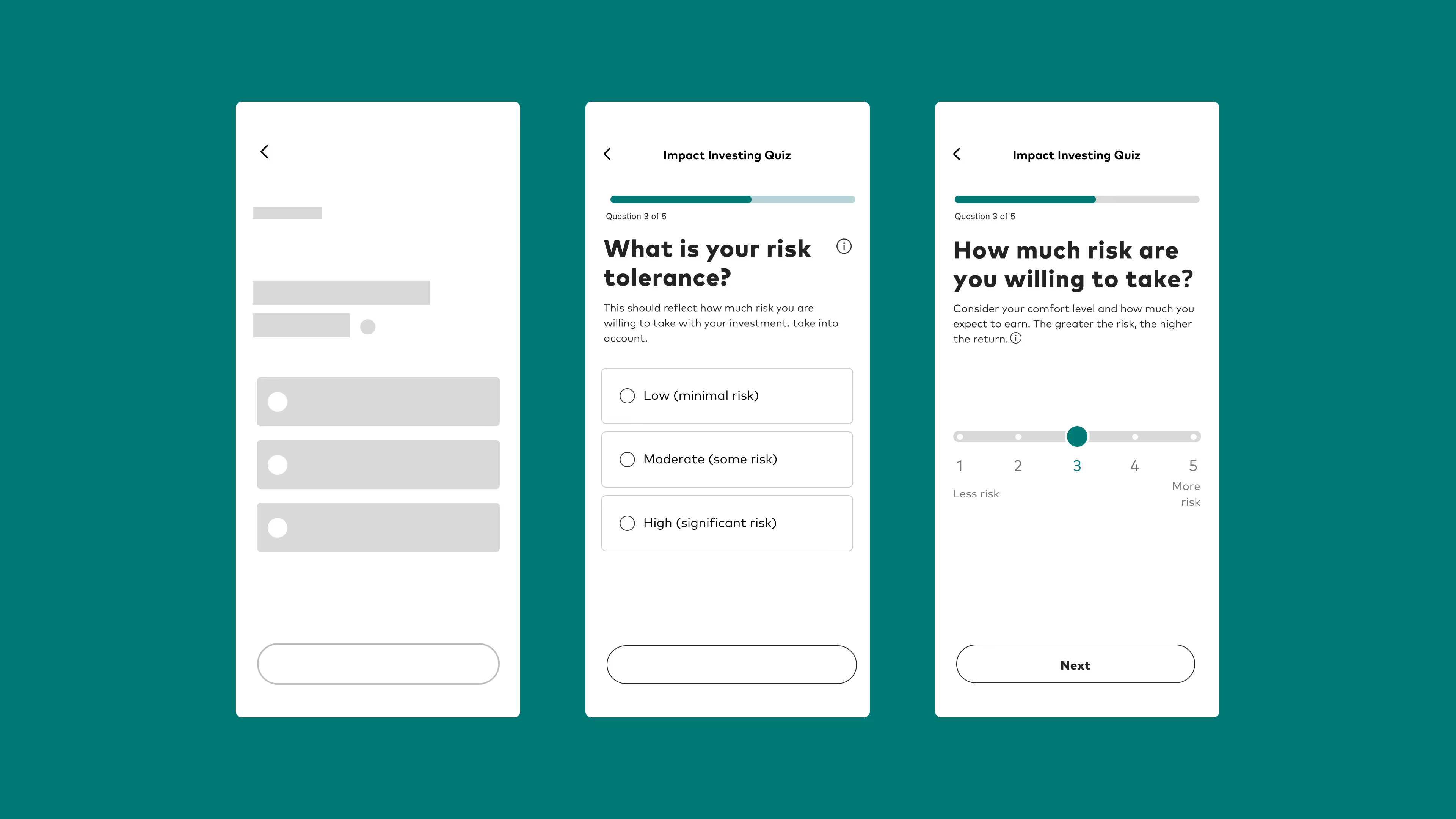
The five-question quiz evaluates a user’s risk tolerance, budget, and goals in the first three slides, then narrows to focus on a specific industry and its associated impact outcome. This progression helps users see how their individual preferences directly shape the recommendations they receive.

Low-fi Wireframes
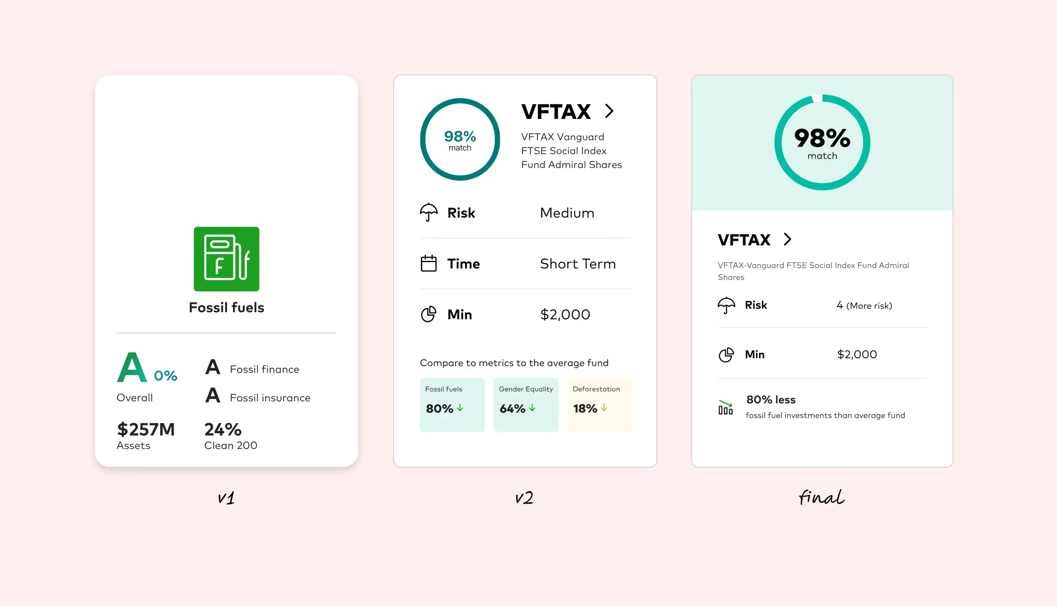
We initially implemented an alphabetical grading system adapted from Gun Free Funds, a site that scores investments based on value categories. However, user feedback indicated the format felt too much like a report card. In response, we shifted to a percentage-based system, which more transparently conveys how each response ties directly to the result of the quiz.
Prototyping
To keep the content consistent with Vanguard’s established language, I refined the copy and standardized the inputs. For example, the risk measurement was updated to match the scale currently used across other Vanguard filters, creating a more seamless and familiar experience for users (from left to right).
reflection
My reflection
With more time, more testing. We would also continue looking at the impact value metrics. Weused gun free funds. Working on this project and at Vanguard pushed me to understand investing. It pushed me to ask questions, meet people from different departments and roles to understand the way the investing can do stuff.